Creating a custom reference line parallel to Y-Axis denoting a dynamic value (changes on filter selection) on a scatter chart
Let’s first begin by looking at what exactly is a scatter chart and how we can use it.
A scatter chart is an extremely useful chart to visualize the relationship between two numerical variables. It is utilized in inferential statistics for visually examining the correlation between two variables.
To create Scatter Chart:
After loading the data from the required source (Excel/MS SQL/SAP/Azure SQL DB or any other), click on the Scatter Chart option located in the Visualizations pane, as shown in the image below. This creates a chart box in the canvas. Nothing is displayed because we are yet to add the required visualization arguments.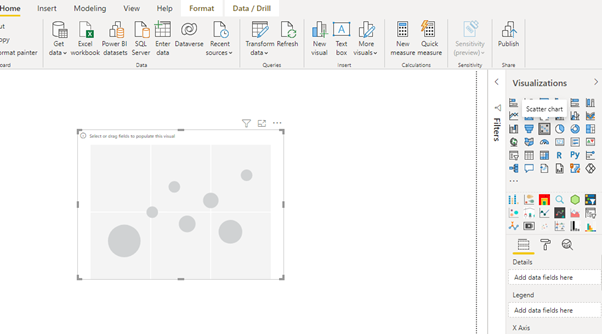
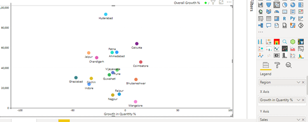
You can resize the chart on the canvas. The next step is to fill the visualization arguments under the Fields option, as shown below. Drag the required variables in the X-Axis, Y-Axis, and Legend fields.
Here we have added Growth In Quantity (%) in the X-Axis field, Sales in the Y-Axis field, and Region in the Legend field.
This will create the scatterplot. There are options to format the plot under the Format tab.
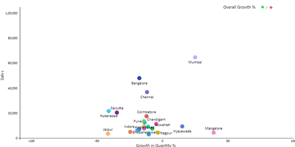
Now that our scatter chart has been created let’s come to our Use Case.
Problem: Creating a custom reference line parallel to Y-Axis denoting a dynamic value (updated on filter selection) on a scatter chart.
Solution: It is simple to create a reference line parallel to Y-Axis in a scatter plot when the value to be plotted on the X-axis is constant, but in the case of a dynamic value that changes on the filter selection (dynamic value here is a measure), it becomes kind of tricky.
In this case, our dynamic value, which changes on Date Filter Selection, is Overall Growth %. It is a measure calculated using some DAX functions.
For this scenario, we can implement a workaround that involves creating another Scatter Chart below the main Scatter Chart and whose X-Axis is in sync with the main Scatter Chart.
Firstly, create two calculated columns, Index (consisting of index values starting from 0) and Index.1 (consisting of index values starting from 1), as these columns will be utilized in our secondary Scatter Chart, which will come below the main Scatter Chart.
As shown below, drag the Overall Growth (%) variable in the X-Axis field and then drag the Index.1 variable in the Legend field and Index variable in the Y-Axis field.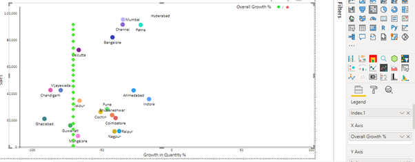
Now we can see in the image above that, a reference line has been created (dotted line) passing from the X-axis at the point of Overall Growth (%)
This is how the chart will finally look like:
Points to be Noted:
- The X-axis of both the charts should be in sync with each other (lower and upper values) and also hide the X-axis and Y-axis and another formatting of the secondary Scatter Chart (one below the main Scatter Chart).
- Disable the background and the tooltip of the secondary Scatter Chart.
- We can change the formatting (Shape, colour, etc.) of the secondary chart according to our requirements. Here we have used a diamond shape, but we can use any other shape as well.
Additional Tip:
If there is a requirement to showcase a red line in case of a negative value (as shown below) and a green line in case of a positive value, we can do it in the following way: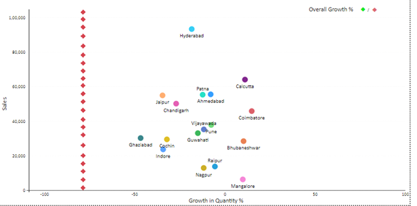
Here as we know, our value is the Overall Growth %.
Before adding the Legend field, define the colour rules in the formatting pane in accordance with the value that is being plotted.
Define the colour to be red in case the value is less than 0 (negative) and green if the value is greater than 0 (positive). After that, drag the required variable in the Legend field.
This is a workaround to create a dynamic reference line parallel to the Y-Axis on a scatter chart.
Conclusion:
- Scatter Chart is an important visualization in Business Intelligence and Analytics.
It is used in inferential statistics to visually examine the extent of the linear relationship between two numerical variables. - It is also used to identify and treat outliers that are data pre-processing elements in data science.
- In Business Intelligence, there might be a requirement to build these charts for a variety of areas, such as market research, causal inference, business statistics, machine learning, exploratory data analysis, time series analysis, and many more.
- This is a great skill set to add because it will be used regularly across sectors and organizational functions.
The solution given above might work for all scenarios, but some modification in the created dummy data might be required.


